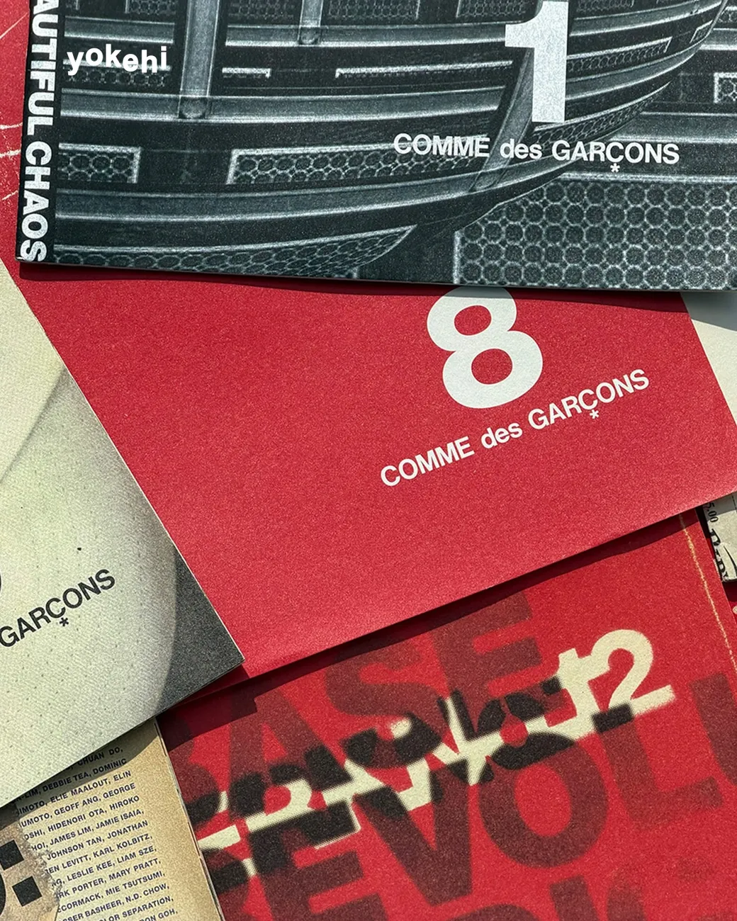
the disappearing art of a design book
Page Spread (page-spread.com) runs out of Tokyo as an online bookstore and a library for graphic design and typography, and it exists because a specific kind of book keeps quietly vanishing. The ones that went out of print. The ones a publisher only ran once. The ones that were never really sold outside a mailing list to begin with. Page Spread’s own about page names this directly as the reason the library side of the shop exists at all, “books were end of sale and also books were rarely offered in markets for various reasons.” Most people judge a design book by its cover anyway, which is exactly the part Page Spread considers the least interesting and the least at risk. A flatlay of spines and covers can only tell you so much about what’s actually printed inside, and Page Spread’s own listings keep circling back to the interior pages instead, the grid a symbol sits on, the paper stock, the binding. No cover photo shows you any of that, and if nobody kept the book, no one would see it at all.
the idea in their own words
Page Spread’s own about page lays out the thesis plainly: “there is a tendency among a high standing front cover to be unnoticeable on the page-spread in a lot of cases,” and the site exists to push back against that, building “the environment that to be able to criticize the design as not fitting within a logical evaluation axis.” A well-designed book, in their framing, gets judged on seven things. Format. Extent. Typography. Materials, paper and binding. Reproduction. Printing. Finishing. Nothing about the cover on that list. The site also draws a clear line on digital: “SPREAD would certainly not want to turn the digital publishing clock back, the books can not be complemented by digital and that is felt by human eye and human hands.” Every listing ends with the same instruction, that the book on Page Spread must be taken in your hands.
Behind the site is Naoyuki Umetsu, born in Tokyo in 1977, who studied communication design at the Fashion Institute of Technology in New York before returning to Japan and starting to collect design books from around the world. The direct spark for Page Spread came in 2011, while staying in Switzerland, when he encountered Typographische Monatsblatter, the Swiss typography journal, and decided to build something similar for a wider audience. As a designer in his own right he has worked for Nike, Converse, Colette, and Isetan. The bookshelf on Page Spread’s own front page tells you where his taste sits. Karel Martens. Wolfgang Weingart. Armin Hofmann. Emil Ruder. Karl Gerstner. Wim Crouwel. The Studio Boggeri archive. helmut schmid.
a decade of readers and a wish that took a while to arrive
Page Spread has been taking comments since it started, and they’re a small time capsule of their own. In mid-2012, an Italian art director named Nicola-Matteo Munari asked the obvious question: is there an actual physical library behind this, somewhere in Tokyo you could visit? Umetsu answered him directly.
SPREAD is still just started from 2012, but it’s a first step for our vision. We would like to achieve the physical space to share the books for the many people as you mention some day.
Naoyuki Umetsu, reply, 2012
Readers kept finding the site in the years after. A graphic design student named Bruce wrote in 2013 asking where to follow the shop’s updates. Thibaud Sabathier wrote from France in 2015 calling it “very useful and well documented for young designers like me.” Niki Yu wrote in 2017, a cover-and-editorial-design specialist herself, calling it “totally a cool place for me.”
The physical space Umetsu described as a someday wish in 2012 has taken a specific, low-key form. Page Spread now gives what it calls intensive support to @martensmartens_tokyo, an Instagram account describing itself simply as “amsterdam in tokyo.” It isn’t a Page Spread-branded shop, and there’s no press release attached to it, just a shop’s founder still acting, more than a decade later, on the same instinct that made him build the bookstore in the first place, putting the Dutch and Swiss design world he fell for in front of people in Tokyo, in a room they can actually walk into.
highlighting 6 picks in stock
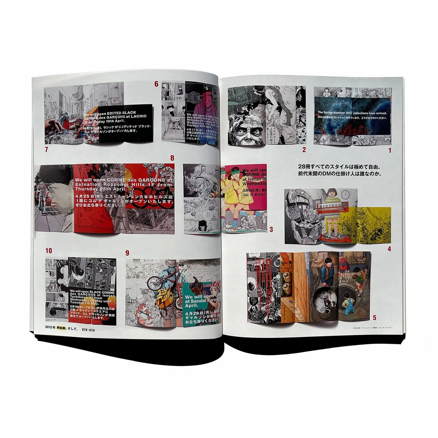
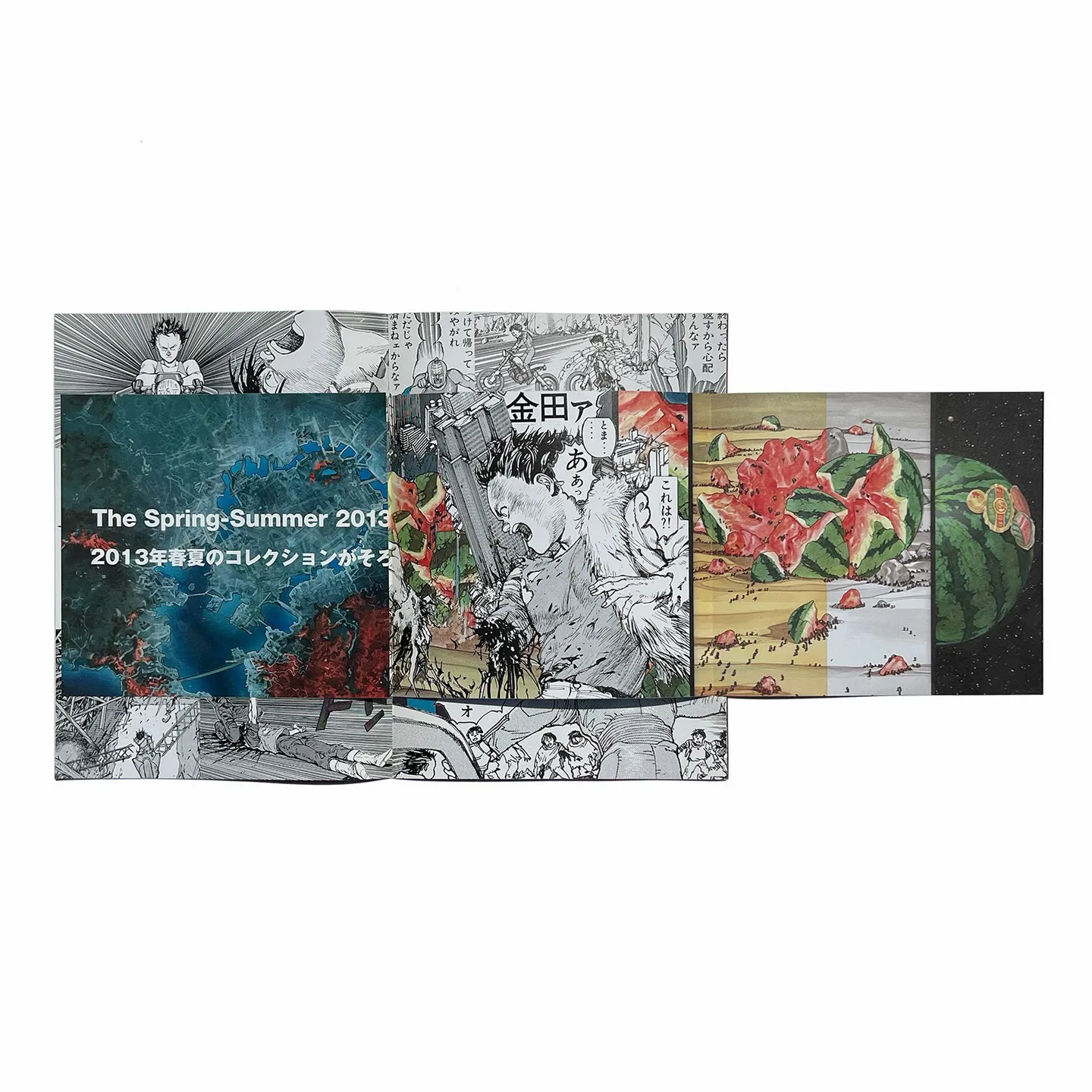
Comme des Garcons 2013 Direct Mail Katsuhiro Otomo
In 2013, Comme des Garcons and Katsuhiro Otomo, the artist and filmmaker behind Akira, collaborated on a run of direct mail booklets that stopped functioning as direct mail. The set runs to 28 pieces (Page Spread’s copy holds nine of them, numbers 1, 2, 5, 8, 13, 14, 15, 24, and 25, plus a Brutus magazine special issue on Otomo collecting covers and spreads from the full run). Covers carry Otomo’s own characters, Kaneda and Tetsuo among them, with his name rendered in kanji and Comme des Garcons’ name sitting quietly underneath. The series was directed entirely by Rei Kawakubo and distributed only to a select client list to announce seasonal collections and store openings, which makes its existence as a genuine collaborative art object, rather than marketing collateral that happened to look good, the more surprising part. Direct mail as a category is more or less gone now, replaced by an email list, which is part of why nobody was supposed to still have all 28 of these in one place twelve years later.

View this post on Instagram
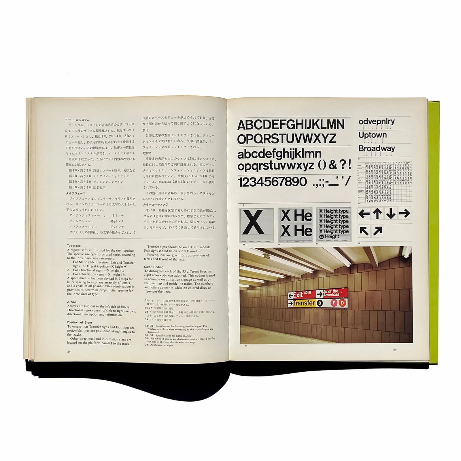
A2 Public Transportation Systems
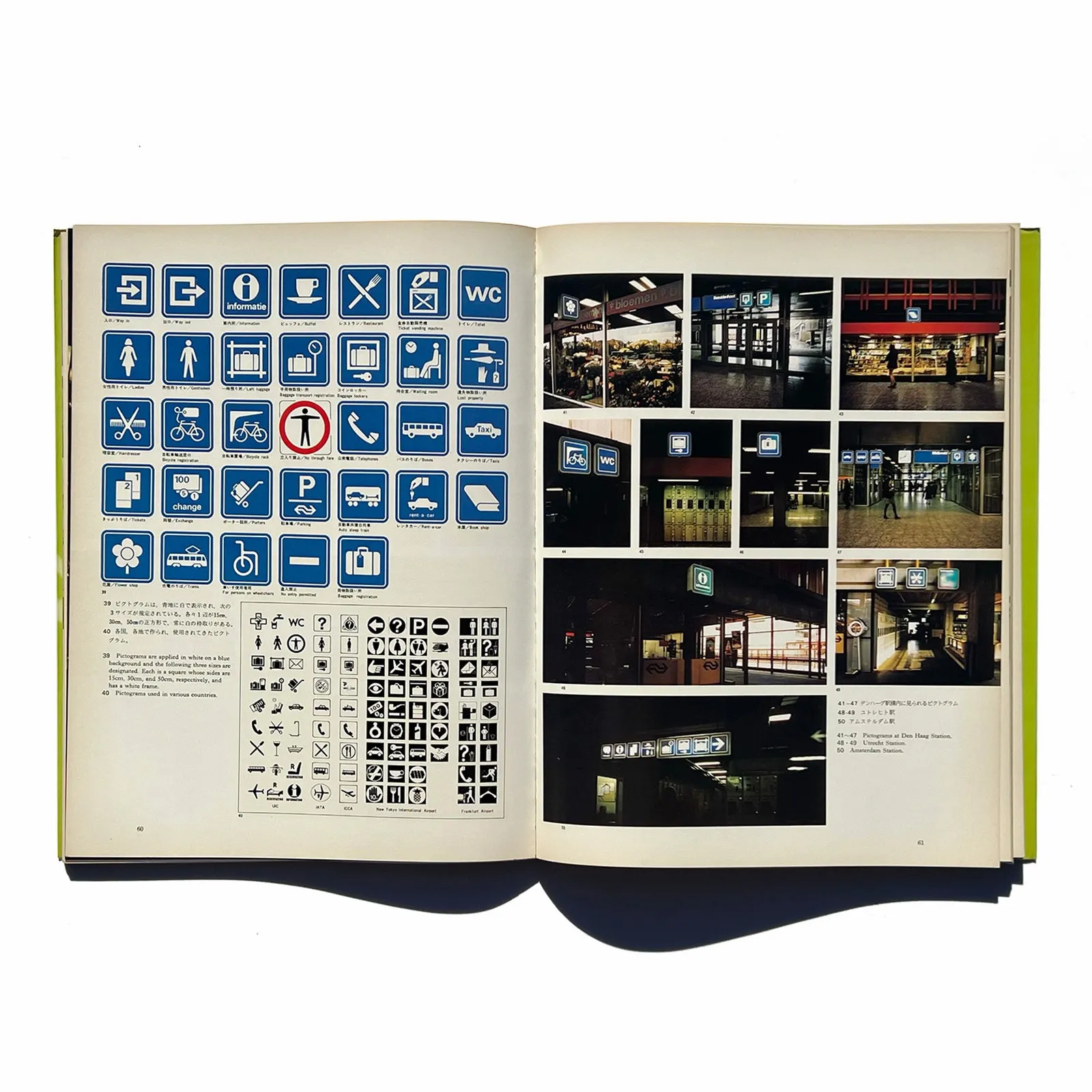
Volume A2 of CoCoMAS‘s Design Systems for Corporations series, published in 1977 and printed in Japanese and English across 164 pages, collects and analyzes corporate design manuals from transit operators around the world, pairing the official documentation with photographs of how it actually looked in use. This volume covers British Rail, Netherlands Railways, the British Airports Authority, Aeroport de Paris, and the subway systems of New York and Mexico City. CoCoMAS was a Japanese research institute dedicated specifically to studying corporate identity, and the series’ whole method, holding a design manual next to a photo of the real signage it produced, is close to Page Spread’s own method applied to books. Nobody commissions a 164-page hardcover like this anymore for the same reason nobody commissions a phone book. A modern identity system lives in a shared drive as a PDF, updated and forgotten about, not bound and printed as something worth keeping on a shelf.

View this post on Instagram
idea 352 Video Game Graphic
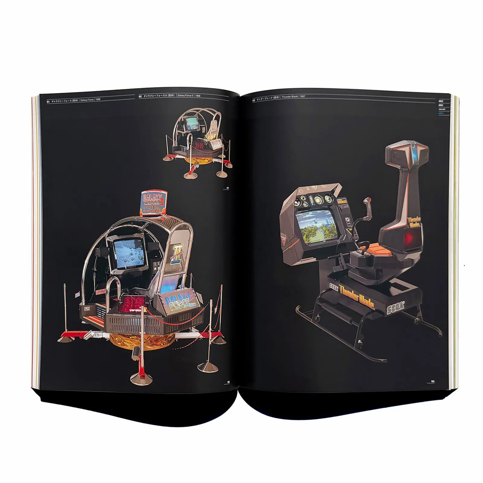
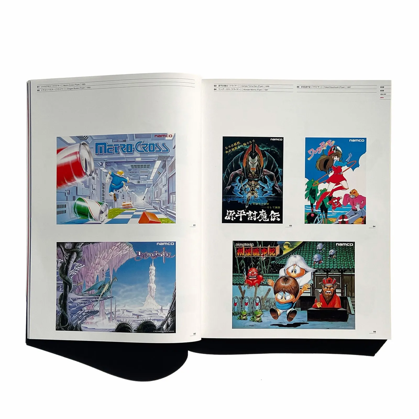
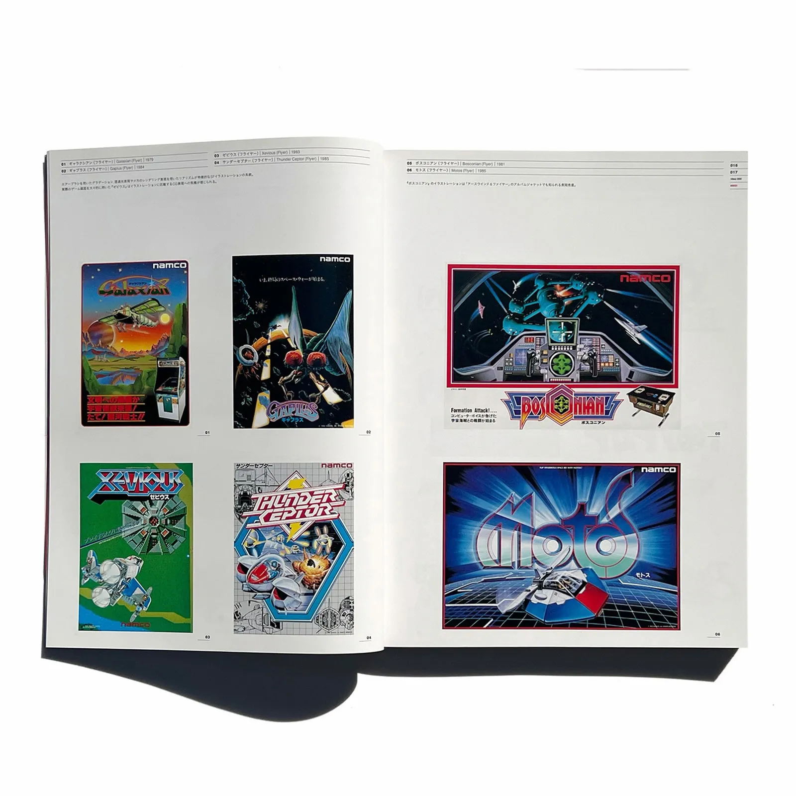
Idea magazine was founded in 1953 to present Japanese graphic art and typography to an international audience, and has been running for more than seventy years since, itself a rare thing in print publishing. Page Spread’s pick from the archive isn’t one of the Swiss-typography issues the magazine is best known for citing, it’s issue 352, from 2012, devoted entirely to the graphics and typefaces of Japanese video games from the late 1970s through the early 2000s. It covers Namco Bandai, Capcom, Sega, a survey called World of Video Game Fonts, and a feature on pinball machine design. The issue’s cover was designed by Kentaro “ANI” Fujimoto, born in Obihiro, Hokkaido in 1973, who formed the design unit Nendo Graphixxx in 1993 and later art directed MTV Japan and Fujitsu’s first web magazine project before relocating back to Hokkaido as a freelancer. Page Spread’s read on the issue is that it ended up being more representative of what the world wants from Japanese design than any of the magazine’s Swiss-leaning issues, precisely because it’s the one that communicates Japanese culture on its own terms. The fonts documented inside are their own small extinction story too, letterforms built around hardware constraints that stopped existing the moment games moved to HD.
View this post on Instagram
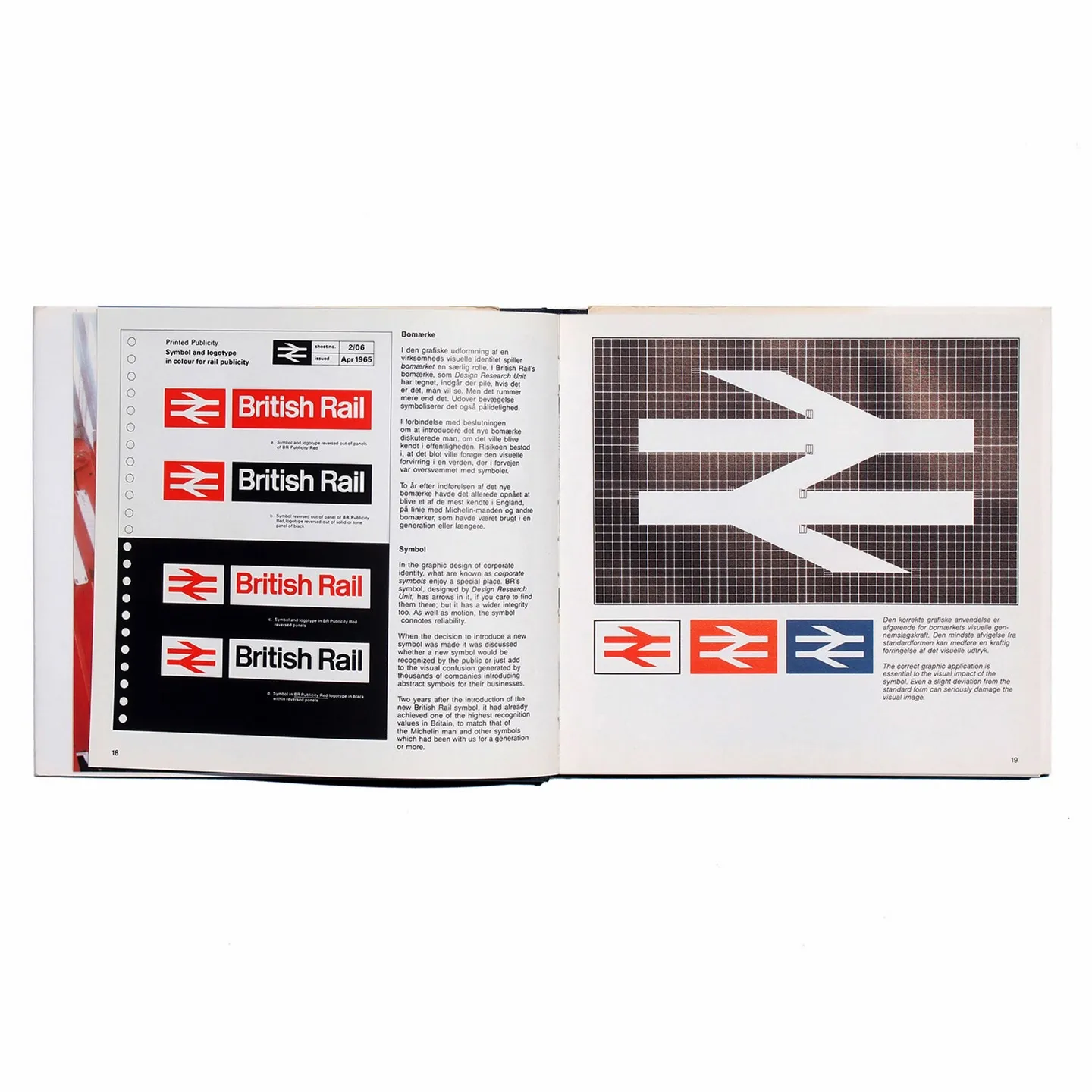
British Rail Design
Published in the late 1980s under the European/EEC Design Editions banner (a joint project of the UK Design Council and the Danish Design Council), this book documents one of the most thorough corporate design programs any national railway has produced, covering rolling stock, station architecture, signage, catering, and industrial design under one visual identity. The book’s own foreword argues that good design sits at the center of good business, not decoration bolted on afterward, and James Cousins, British Rail’s Director of Industrial Design, makes the case for a flexible, forward-looking identity system over nostalgic pastiche. British Rail itself doesn’t exist anymore either, broken up and privatised in the 1990s, which makes this less a design manual than a record of an entire design department that got dissolved along with the company it worked for.

View this post on Instagram
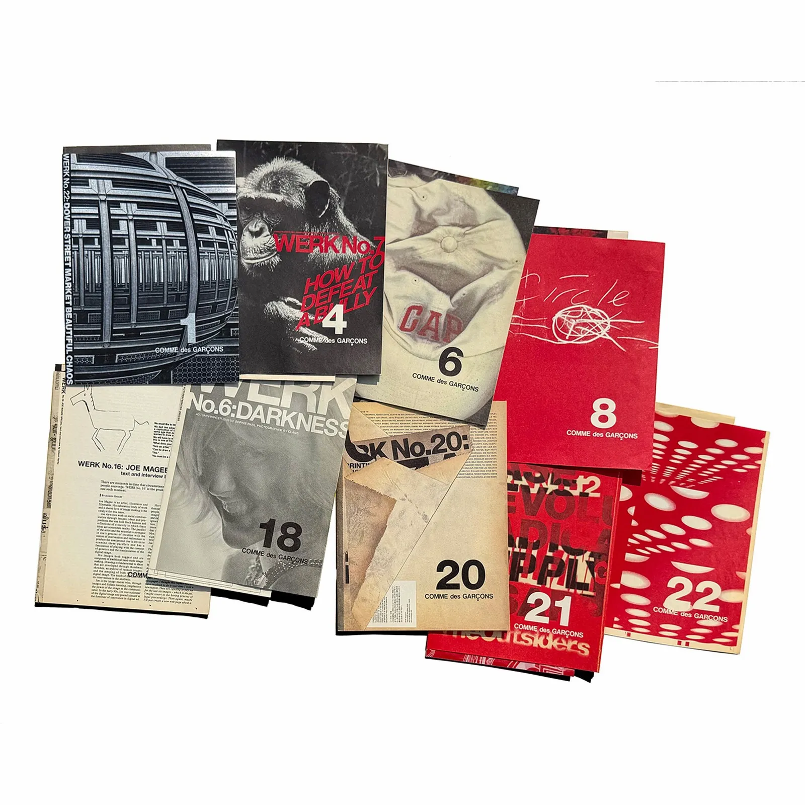
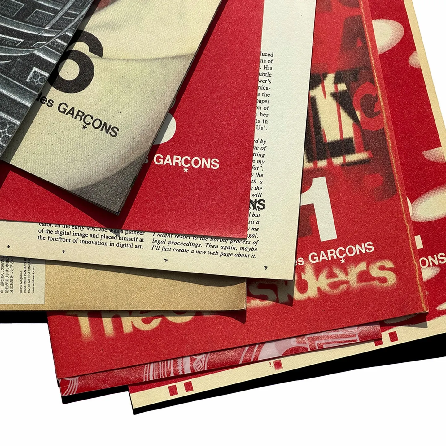
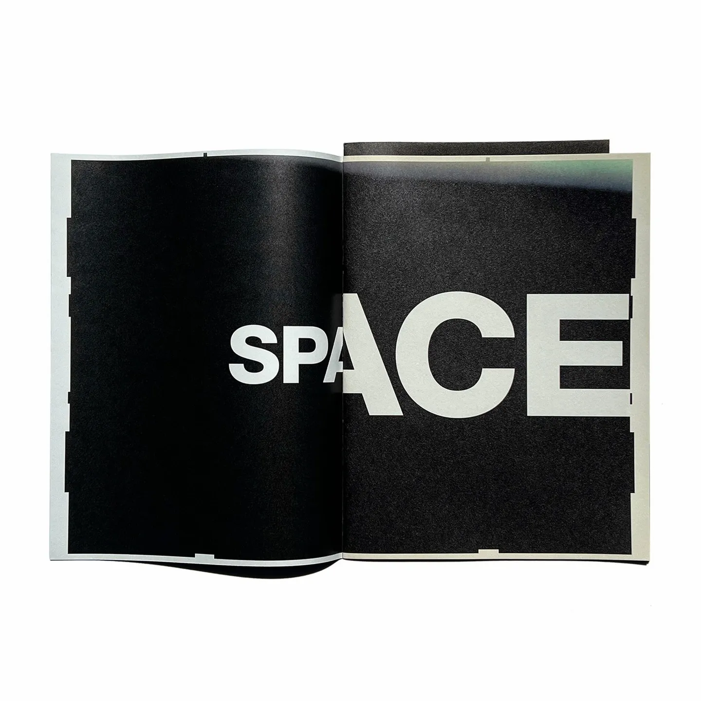
Comme des Garcons 2016 Direct Mail WERK
In 2016, the Comme des Garcons direct mail series turned to Theseus Chan and his cult Singaporean publication WERK, re-editing fragments of WERK’s now hard-to-find original issues into zine-format mailers sent to a select client list. It’s widely considered one of the strongest years the direct mail series ever produced, less a promotional gesture than what Page Spread calls a quiet act of archival redistribution, taking rare editorial content and putting it back into circulation in an intimate, physical format. The original WERK issues being redistributed here are the clearest case on this whole list. They were independently published, printed in small runs, and already close to unobtainable within a decade of coming out. Page Spread has carried this set twice, once as a nine-issue grouping (numbers 1, 4, 6, 8, 9, 18, 20, 21, and 22, made in collaboration with @theseuschanwork) and once as a smaller seven-issue set (numbers 1, 6, 8, 9, 20, 21, and 22).
View this post on Instagram
View this post on Instagram
shipping from tokyo
Everything above ships worldwide from Tokyo, tracking number included. A transit design binder from a company that hasn’t existed since the 90s. A video game issue most readers would skip on their way to the magazine’s better-known Swiss-typography years. A Comme des Garcons zine built out of a Singaporean magazine that was already going out of print before Comme des Garcons reprinted it. Each one needed somebody to keep pulling it back into circulation, or it would have stayed out of print for good. Page Spread is the one place still doing that, still betting somebody out there wants to hold the actual object.
Sources:Page Spread, about · Page Spread on Instagram · Naoyuki Umetsu, biography via h-a-k-o.com · Page Spread, A2 Public Transportation Systems · Page Spread, idea 352 Video Game Graphic · Page Spread, Comme des Garcons 2013 DM Katsuhiro Otomo · Page Spread, British Rail Design · Page Spread, Comme des Garcons 2016 DM WERK, 9-issue set · Page Spread, Comme des Garcons 2016 DM WERK, 7-issue set