the labels that became the design
A recent post by @culted made a point that has been sitting with me for a while: the inside of a garment might be the most underrated design surface in fashion. Care tags started out as bookkeeping, a way for brands to identify their own product and for factories to keep track of runs. Over time some houses have turned that hidden square of cotton into something closer to a signature, and a few have taken it further than that.
View this post on Instagram
Most people check the label before anything else, brand first, design second, which is why so many of us wear things with the tags left out on purpose. It’s not a new habit, but it’s gotten more obvious, and the labels themselves have started to reflect it.
margiela and turning the tag into the house
Margiela is where any conversation about this has to start. Martin Margiela and Jenny Meirens founded the house in 1988 and stitched a completely blank white cotton square into every piece, held on with four visible stitches at the corners so it could be removed if the wearer wanted. Meirens told the New York Times that customers walking into a shop and seeing strong clothes with no name on them would be more curious, which turned out to be the whole strategy in one sentence.
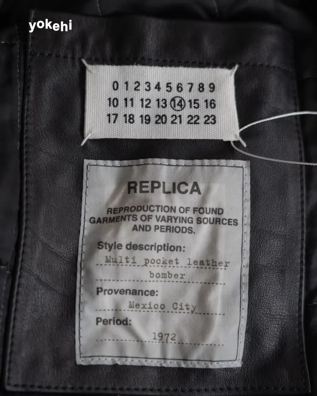
In 1997 the blank tag became the numerical tag. Zero through twenty three across three rows, one number circled, the circled number telling you which line of the house you were holding. Line 0 is the Artisanal collection, hand-remade pieces from found materials. Line 1 is the women’s ready to wear. Line 10 is the men’s. Line 4 is women’s basics, 14 is men’s basics, 11 is accessories, 22 is footwear, and so on. Only around ten of the numbers are in regular use, which means the rest sit there as a kind of quiet map of the house you are not fully seeing.
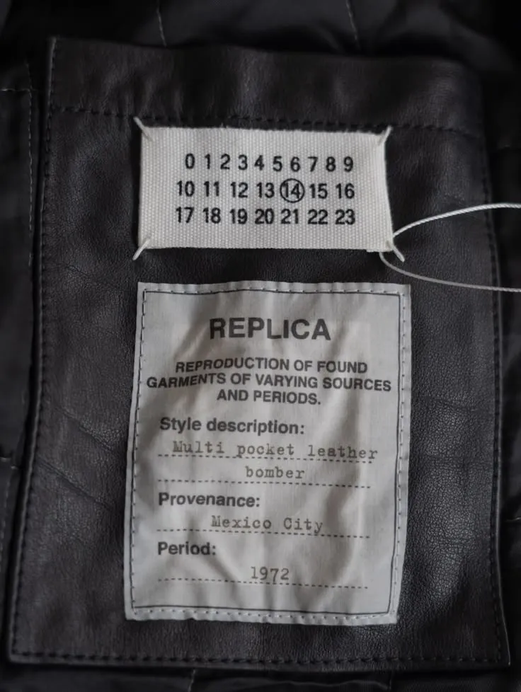
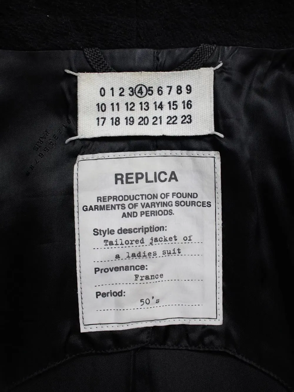
The Replica line takes the same idea further. Instead of vaguely referencing a period, each piece carries a second label with typewritten fields for style description, provenance, and period. The label does the work a museum wall text usually does.
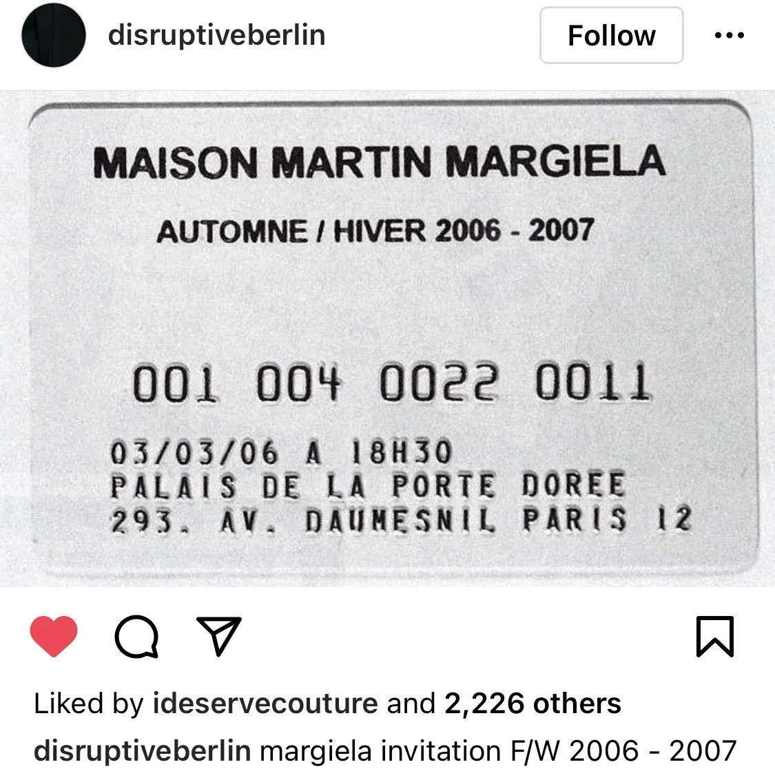
The invitations follow the same logic. The FW 2006 to 2007 show was announced with a metal card that looked like a debit card. It reads more like something you’d find in a wallet than a fashion invitation, which is exactly why it works.
helmut lang and the blank line
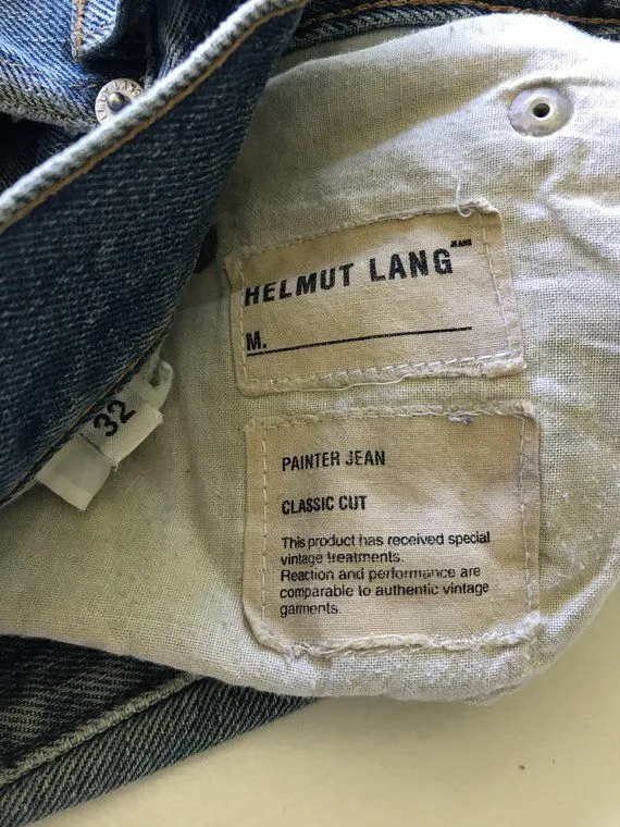
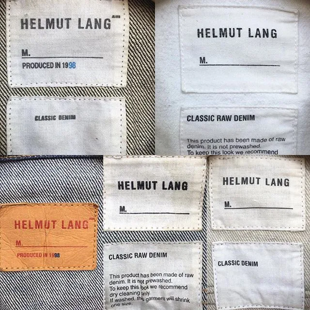
The original Helmut Lang era (the late 90s through the early 2000s, before the Prada acquisition and everything that came after) treated the inside of a garment like a shipping document. A plain cotton label with the wordmark, the word M. and a blank line for the wearer’s name, and a second label underneath naming the fabric. Nothing decorative. It looked like it belonged inside a piece of workwear, consistent with everything else the label was doing at the time.
kapital and the label as tiny illustration
Kapital was founded in Kojima, Okayama in 1984 by Toshikiyo Hirata, who had spent time in the United States and returned to Japan wanting to make denim with a Japanese sensibility rather than another copy of American jeans. The Kojima region has been the centre of Japanese denim manufacturing since the 1960s and 70s, and Kapital sits inside that tradition while also pushing against it, mixing sashiko stitching, boro patchwork and traditional dyes into pieces that are as much collage as clothing.
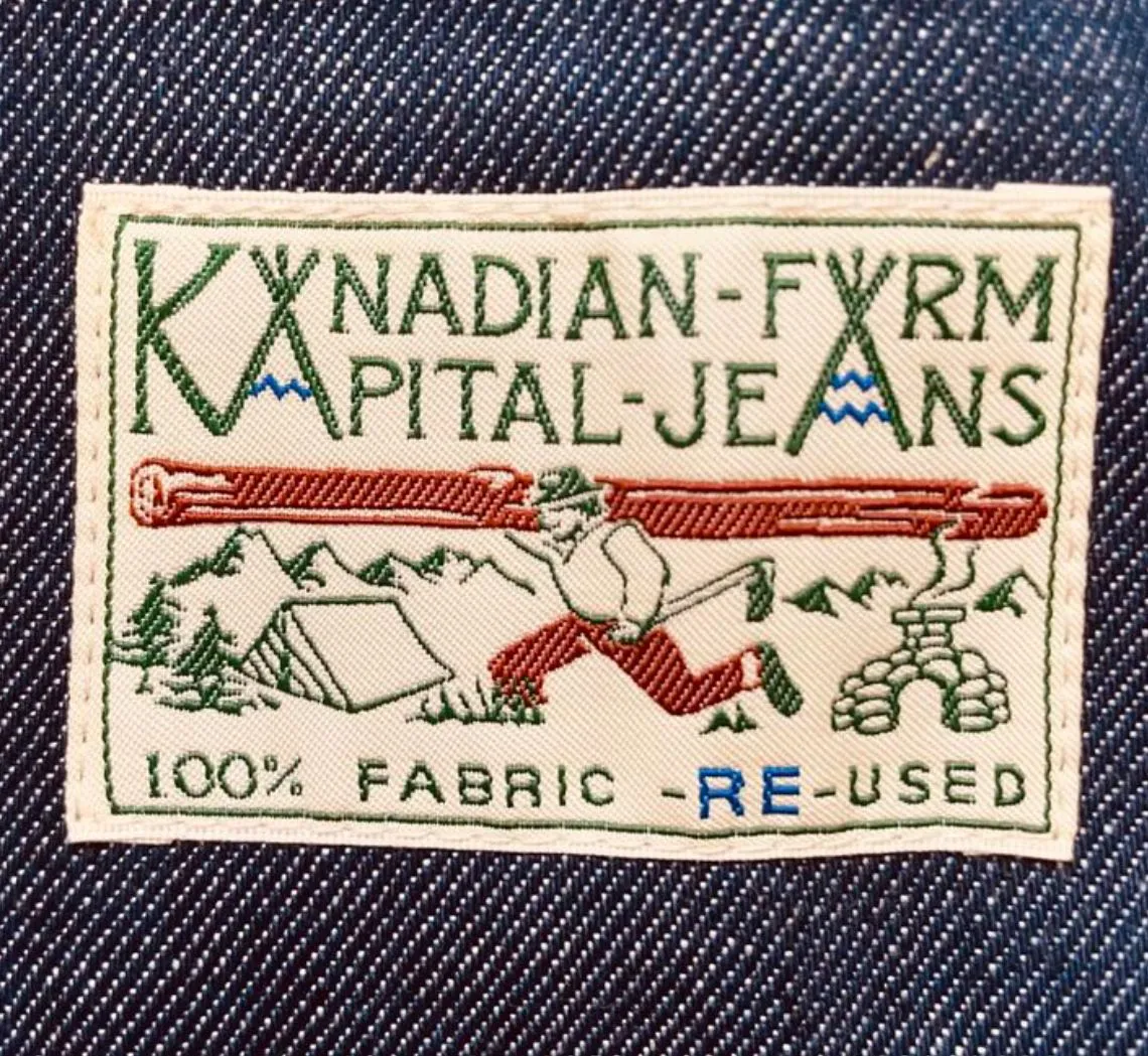
The woven patches are part of the vocabulary. The Kanadian Farm label reads like something from a mid-century American workwear brand that never quite existed. It is not vintage, but it is not quite pastiche either, more a small piece of storytelling stitched inside the garment for whoever is paying attention.
off-white and the label as ongoing design surface
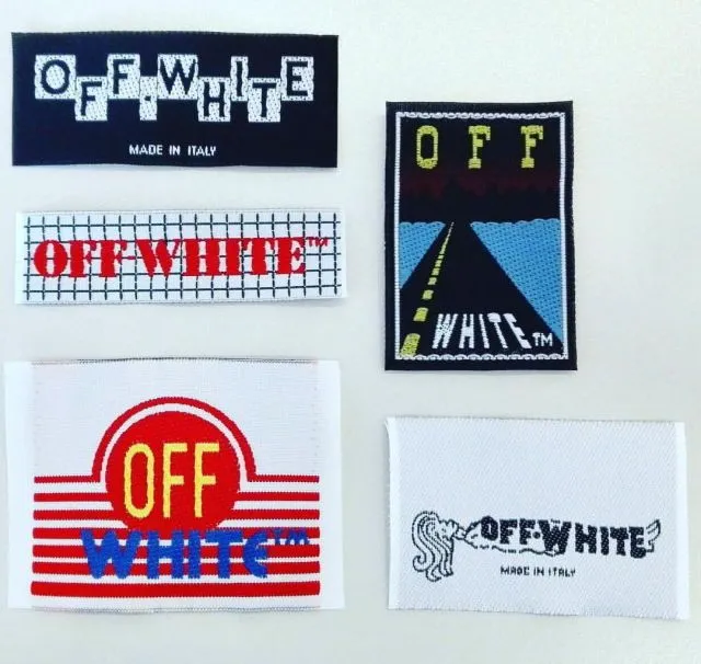
Off-White, under Virgil Abloh, treated the label the way some houses treat prints. Rather than one recognisable tag stitched into everything, the brand cycled through a wide range of woven labels, each with its own graphic identity but all still legible as Off-White. The tags did not sit quietly. They were part of the visual identity of the piece, on the same level as the zip ties and the quotation marks the brand became known for.
vetements and exposing the production layer
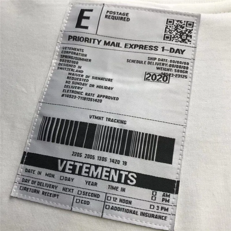
Vetements has used the label to borrow more than one bureaucratic register. One tag mimics a shipping form entirely, less a designer label than something a customs officer would stamp.
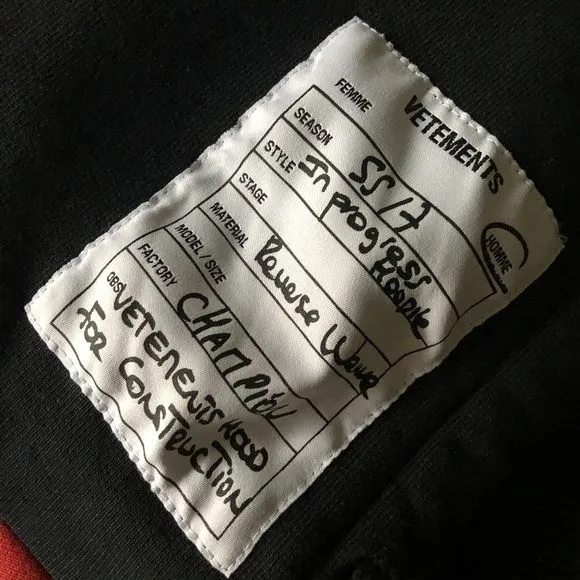
Other pieces keep the format of an actual factory sample tag instead, filled in by hand in ballpoint pen. The result reads like the piece is still in production and was never meant to be seen by a customer, which is the point.
balenciaga from wash tag to energy label
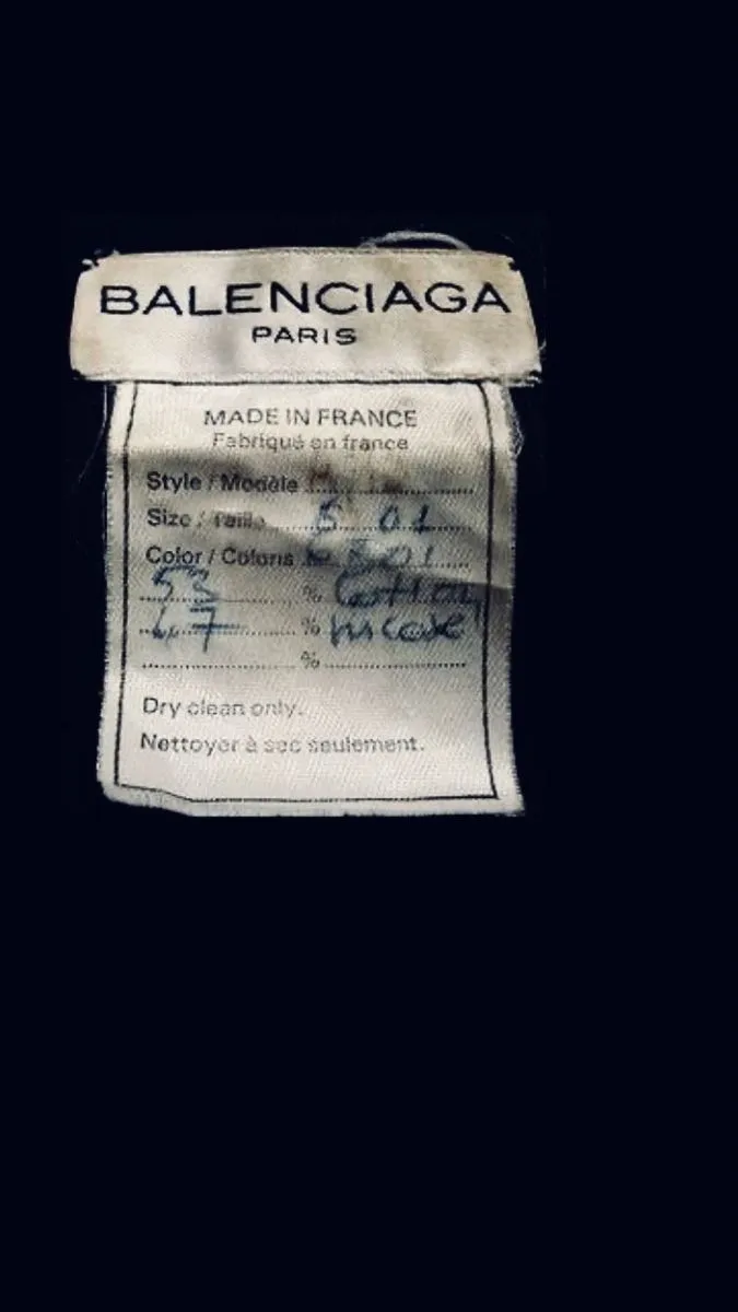
Balenciaga is interesting because you can see the shift happening inside a single house. An older Balenciaga Paris tag reads like a couture label from any French house of its era, quiet, functional, ignorable if you were not looking.
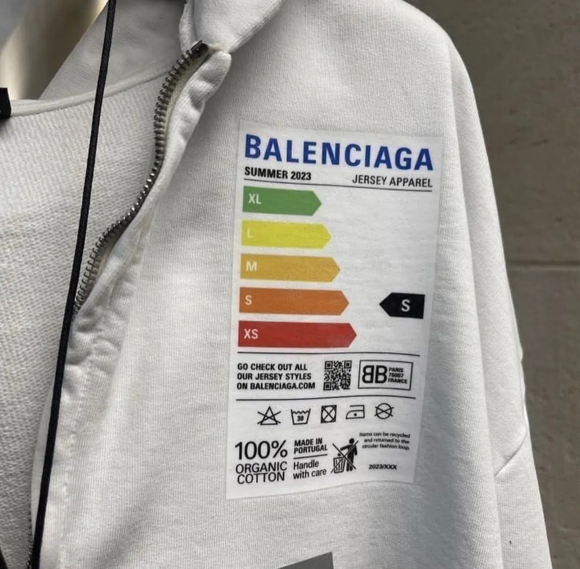
The Summer 2023 collection took a completely different route: a large printed label modelled on the EU energy rating stickers you see on fridges and washing machines. The label is bigger than most brand patches and is clearly meant to be seen. This was Demna’s period at the house, and it fits with a wider approach at the time of pulling bureaucratic and utility design (lost wallets as show invitations, receipts, hazard tape) into the collection.
bottega veneta and the vintage reference
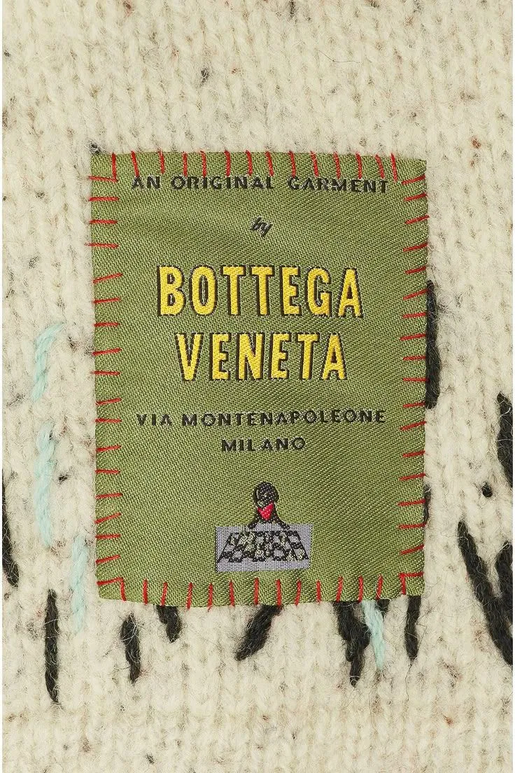
Bottega Veneta’s green woven label with red blanket stitching borrows heavily from mid-century Italian knitwear and outdoor labels, and does it with real care rather than as a wink. On a chunky hand knit it lands as part of the garment’s story rather than a corporate signature.
what the label gives away
The care tag is a small square of cotton or synthetic that was never really meant for the customer, and that is exactly what makes it interesting when a house decides to design it properly. The examples above sit on a spectrum, from Margiela’s near total refusal to brand anything, to Balenciaga’s decision to make the label larger than most logos. Somewhere along that spectrum is the moment when the label stopped being paperwork and became part of the garment. For anyone new to fashion who cares about design more than logos, the tag is often the honest place to look, because it tends to say more about how a house thinks than whatever is printed on the front.
Sources:Culted on Instagram · Nss magazine, the meaning of Maison Margiela's numbers · Trussarchive, how to identify Maison Margiela · Haven, exploring Kapital · Hypebeast, Balenciaga Summer 2023 The Mud Show